Older blog entries for danbri (starting at number 202)

Talis

Most of us around RDF and the Semantic Web have by now probably heard the news about Talis; if not, see Leigh Dodds’ blog post. Talis are shutting down their general activities around Semantic Web and Linked Data, including the Kasabi data marketplace. Failures are usually complex and Twitter is already abuzz with punditry, speculation and ill-judged extrapolation. I just wanted to take a minute aside from all that to say something that I’ve not got around to before: “thanks!”.

Regardless of the business story, we ought to appreciate on a personal level all the hard work that the team (past and present) at Talis have put into popularising the ideas and technology around Linked Data. Talis had an extraordinarily bright, energetic and committed team, who put great passion into their work – and into supporting the work of others. All of us in the community around Linked Data have benefitted enormously from this, and will continue to benefit from the various projects and initiatives that Talis have supported.  Perhaps in a nearby parallel universe, there is a thriving alternate Talis whose efforts benefited the business more, and the commons less. We can only speculate. In this universe, the most appropriate word at this point is just “thanks”…

Syndicated 2012-07-10 14:07:03 from danbri's foaf stories

Everything Still Looks Like A Graph (but graphs look like maps)

Last October I posted a writeup of some experiments that illustrate item-to-item similarities from Apache Mahout using Gephi for visualization. This was under a heading that quotes Ben Fry, “Everything looks like a graph” (but almost nothing should ever be drawn as one). There was also some followup discussion on the Gephi project blog.

I’ve just seen a cluster of related Gephi experiments, which are reinforcing some of my prejudices from last year’s investigations:

These are all well worth a read, both for showing the potential and the limitations of Gephi. It’s not hard to find critiques of the intelligibility or utility of squiggly-but-inspiring network diagrams; Ben Fry’s point was well made. However I think each of the examples I link here (and my earlier experiments) show there is some potential in such layouts for showing ‘similarity neighbourhoods’ in a fairly appealing and intuitive form.

In the case of the history of Philosophy it feels a little odd using a network diagram since the chronological / timeline aspect is quite important to the notion of a history. But still it manages to group ‘like with like’, to the extent that the inter-node connections probably needn’t even be shown.

I’m a lot more comfortable with taking the ‘everything looks like a graph’ route if we’re essentially generating a similarity landscape. Whether these ‘landscapes’ can be made to be stable in the face of dataset changes or re-generation of the visualization is a longer story. Gephi is currently a desktop tool, and as such has memory issues with really large graphs, but I think it shows the potential for landscape-oriented graph visualization. Longer term I expect we’ll see more of a split between something like Hadoop+Mahout for big data crunching (e.g. see Mahout’s spectral clustering component which takes node-to-node affinities as input) and something WebGL and browser-based UI for the front-end. It’s a shame the Gephi efforts in this direction (GraphGL) seem to have gone quiet, but for those of you with modern graphics cards and browsers, take a look at alterqualia’s ‘dynamic terrain‘ WebGL demo to get a feel for how landscape-shaped datasets could be presented…

Also btw look at the griffsgraphs landscape of literature; this was built solely from ‘influences’ relationships from Wikipedia… then compare this with the landscapes I was generating last year from Harvard bibliographic data. They were both built solely using subject classification data from Harvard. Now imagine if we could mutate the resulting ‘map’ by choosing our own weighting composited across these two sources. Perhaps for the music or movies or TV areas of the map we might composite in other sources, based on activity data analysed by recommendation engine, or just different factual relationships.

There’s no single ‘correct’ view of the bibliographic landscape; what makes sense for a phd researcher, a job seeker or a schoolkid will naturally vary. This is true also of similarity measures in general, i.e. for see-also lists in plain HTML as well as fancy graph or landscape-based visualizations. There are more than metaphorical comparisons to be drawn with the kind of compositing tools we see in systems like Blender, and plenty of opportunities for putting control into end-user rather than engineering hands.

In just the last year, Harvard (and most recently OCLC) have released their bibliographic dataset for public re-use, the Wikidata project has launched, and browser support for WebGL has been improving with every release. Despite all the reasonable concerns out there about visualizing graphs as graphs, there’s a lot to be said for treating graphs as maps…

Syndicated 2012-07-03 11:44:48 from danbri's foaf stories

MAMP / MySQL config notes

Problem: MySQL taking forever to load some large data dumps. Forever or longer.

“mysql> show processlist;” shows it wedged at “Repair with keycache” and “Waiting for table metadata lock”.

According to a handy Stack Overflow article, this is a known and dreaded condition, which can be addressed by making sure tmp dir has plenty of space, and increasing size of myisam_max_sort_file_size from 2G (2146435072) to 30G (32212254720). Using MAMP 1.9.6 it took some more digging to find out how to add a local my.cnf settings file for MySQL. This now lives in /Applications/MAMP/conf/my.cnf (I added into [mysqld] section a line saying ‘myisam_max_sort_file_size = 30G’.

Does this work? Well I don’t know yet. But enough times I’ve searched around before and found my own notes, that I thought I should at least write this much down for my future self to find :)

Syndicated 2012-01-25 13:51:30 from danbri's foaf stories

Building R’s RGL library for OSX Snow Leopard

RGL is needed for nice interactive 3d plots in R, but a pain to find out how to build on a modern OSX machine.

“The rgl package is a visualization device system for R, using OpenGL as the rendering backend. An rgl device at its core is a real-time 3D engine written in C++. It provides an interactive viewpoint navigation facility (mouse + wheel support) and an R programming interface.”

The following commands worked for me in OSX Snow Leopard:

  • svn checkout svn://svn.r-forge.r-project.org/svnroot/rgl
  • R CMD INSTALL ./rgl/pkg/rgl –configure-args=”–disable-carbon” rgl

Here’s a test that should give an interactive 3D display if all went well, using a built-in dataset:

library(rgl)
cars.data <- as.matrix(sweep(mtcars[, -1], 2, colMeans(mtcars[, -1]))) # cargo cult'd
xx <- svd(cars.data %*% t(cars.data))
xxd <- xx$v %*% sqrt(diag(xx$d))
x1 <- xxd[, 1]
y1 <- xxd[, 2]
z1 <- xxd[, 3]
plot3d(x1,y1,z1,col="green", size=4)
text3d(x1,y1,z1, row.names(mtcars))

Syndicated 2011-12-08 16:35:54 from danbri's foaf stories

Dilbert schematics

How can we package, manage, mix and merge graph datasets that come from different contexts, without getting our data into a terrible mess?

During the last W3C RDF Working Group meeting, we were discussing approaches to packaging up ‘graphs’ of data into useful chunks that can be organized and combined. A related question, one always lurking in the background, was also discussed: how do we deal with data that goes out of date? Sometimes it is better to talk about events rather than changeable characteristics of something. So you might know my date of birth, and that is useful forever; with a bit of math and knowledge of today’s date, you can figure out my current age, whenever needed. So ‘date of birth’ on this measure has an attractive characteristic that isn’t shared by ‘age in years’.

At any point in time, I have at most one ‘age in years’ property; however, you can take two descriptions of me that were at some time true, and merge them to form a messy, self-contradictory description. With this in mind, how far should we be advocating that people model using time-invariant idioms, versus working on better packaging for our data so it is clearer when it was supposed to be true, or which parts might be more volatile?

The following scenario was posted to the RDF group as a way of exploring these tradeoffs. I repeat it here almost unaltered. I often say that RDF describes a simplified – and sometimes over-simplified – cartoon universe. So why not describe a real cartoon universe? Pat Hayes posted an interesting proposal that explores an approach to these problems; since he cited this scenario, I wrote it up as a blog post.

Describing Dilbert: theory and practice

Consider an RDF vocabulary for describing office assignments in the cartoon universe inhabited by Dilbert. Beyond the name, the examples here aren’t tightly linked to the Dilbert cartoon. First I describe the universe, then some ways in which we might summarise what’s going on using RDF graph descriptions. I would love to get a sense for any ‘best practice’ claims here. Personally I see no single best way to deal with this, only different and annoying tradeoffs.

So — this is a fictional highly simplified company in which workers each are assigned to occupy exactly one cubicle, and in which every cubicle has at most one assigned worker. Cubicles may also sometimes be empty.

  • Every 3 months, the Pointy-haired boss has a strategic re-organization, and re-assigns workers to cubicles.
  • He does this in a memo dictated to Dogbert, who will take the boss’s vague and forgetful instructions and compare them to an Excel spreadsheet. This, cleaned up, eventually becomes an emailed Word .doc sent to the all-staff@ mailing list.
  • The word document is basically a table of room moves, it is headed with a date and in bold type “EFFECTIVE IMMEDIATELY”, usually mailed out mid-evening and read by staff the next morning.
  • In practice, employees move their stuff to the new cubicles over the course of a few days; longer if they’re on holiday or off sick. Phone numbers are fixed later, hopefully. As are name badges etc.
  • But generally the move takes place the day after the word file is circulated, and at any one point, a given cubicle can be fairly said to have at most one official occupant worker.

So let’s try to model this in RDF/RDFS/OWL.

First, we can talk about the employees. Let’s make a class, ‘Employee’.

In the company systems, each employee has an ID, which is ‘e-’ plus an integer. Once assigned, these are never re-assigned, even if the employee leaves or dies.

We also need to talk about the office space units, the cubes or ’Cubicles’. Let’s forget for now that the furniture is movable, and treat each Cubicle as if it lasts forever. Maybe they are even somehow symbolic cubicle names, and the furniture that embodies them can be moved around to diferent office locations. But we don’t try modelling that for now.

In the company systems, each cubicle has an ID, which is ‘c-’ plus an integer. Once assigned, these are never re-assigned, even if the cubicle becomes in any sense de-activated.

Let’s represent these as IRIs. Three employees, three cubicles.

  • http://example.com/e-1
  • http://example.com/e-2
  • http://example.com/e-3
  • http://example.com/c-1000
  • http://example.com/c-1001
  • http://example.com/c-1002

We can describe the names of employees. Cubicicles also have informal names. Let’s say that neither change, ever.

  • e-1 name ‘Alice’
  • e-2 name ‘Bob’
  • e-3 name ‘Charlie’
  • c-1000 ‘The Einstein Suite’.
  • c-1001 ‘The doghouse’.
  • c-1002 ‘Helpdesk’.

Describing these in RDF is pretty straightforward.

Let’s now describe room assignments.

At the beginning of 2011 Alice (e-1) is in c-1000; Bob (e-2) is in c-1001; Charlie (e-3) is in c-1002. How can we represent this in RDF?

We define an RDF/RDFS/OWL relationship type aka property, called eg:hasCubicle

Let’s say our corporate ontologist comes up with this schematic description of cubicle assignments:

  • eg:hasCubicle has a domain of eg:Employee, a range of eg:Cubicle. It is an owl:FunctionalProperty, because any Employee has at most one Cubicle related via hasCubicle.
  • it is an owl:InverseFunctionalProperty, because any Cubicle is the
  • value of hasCubicle for no more than one Employee.

So… at beginning of 2011 it would be truthy to assert these RDF claims:

Now, come March 10th, everyone at the company receives an all-staff email from Dogbert, with cubicle reassignments. Amongst other changes, Alice and Bob are swapping cubicles, and Charlie stays in c-1002.

Within a week or so (let’s say by March 20th to be sure) The cubicle moves are all made real, in terms of where people are supposed to be based, where they are, and where their stuff and phone line routings are.

The fictional world by March 20th 2011 is now truthily described by the following claims:

Questions / view from Named Graphs.

1. Was it a mistake, bad modelling style etc, to describe things with ’hasCubicle’? Should we have instead described a date-stamped ‘CubicleAssignmentEvent’ that mentions for example the roles of Dogbert, Alice, and some Cubicle? Is there a ‘better’ way to describe things? Is this an acceptable way to describe things?

2. How should we express then the notion that each employee has at most one cubicle and vice versa? Is this
appropriate material to try to capture in OWL?

3. How should a SPARQL store or TriG++ document capture the different graphs describing the evolving state of the company’s office-space allocations?

4. Can we offer any practical but machine-readable metadata that helps indicate to consuming applications
the potential problems that might come from merging different graphs that use this modelling style?
For example, can we write any useful definition for a class of property “TimeVolatileProperty” that could help people understand risk of merging different RDF graphs using ‘hasCubicle’?

5. Can the ‘snapshot of the world-as-it-now-is’ view and the ’transaction / event log view’ be equal citizens, stored in the same RDF store, and can metadata / manifest / table of contents info for that store be used to make the information usefully exploitable and reasonably truthy?

Syndicated 2011-11-03 14:29:50 from danbri's foaf stories

Linked Literature, Linked TV – Everything Looks like a Graph

cloud

Ben Fry in ‘Visualizing Data‘:

Graphs can be a powerful way to represent relationships between data, but they are also a very abstract concept, which means that they run the danger of meaning something only to the creator of the graph. Often, simply showing the structure of the data says very little about what it actually means, even though it’s a perfectly accurate means of representing the data. Everything looks like a graph, but almost nothing should ever be drawn as one.

There is a tendency when using graphs to become smitten with one’s own data. Even though a graph of a few hundred nodes quickly becomes unreadable, it is often satisfying for the creator because the resulting figure is elegant and complex and may be subjectively beautiful, and the notion that the creator’s data is “complex” fits just fine with the creator’s own interpretation of it. Graphs have a tendency of making a data set look sophisticated and important, without having solved the problem of enlightening the viewer.

markets

Ben Fry is entirely correct.

I suggest two excuses for this indulgence: if the visuals are meaningful only to the creator of the graph, then let’s make everyone a graph curator. And if the things the data attempts to describe — for example, 14 million books and the world they in turn describe – are complex and beautiful and under-appreciated in their complexity and interconnectedness, … then perhaps it is ok to indulge ourselves. When do graphs become maps?

I report here on some experiments that stem from two collaborations around Linked Data. All the visuals in the post are views of bibliographic data, based on similarity measures derrived from book / subject keyword associations, with visualization and a little additional analysis using Gephi. Click-through to Flickr to see larger versions of any image.

Firstly, in my ongoing work in the NoTube project, we have been working with TV-related data, ranging from ‘social Web’ activity streams, user profiles, TV archive catalogues and classification systems like Lonclass. Secondly, over the summer I have been working with the Library Innovation Lab at Harvard, looking at ways of opening up bibliographic catalogues to the Web as Linked Data, and at ways of cross-linking Web materials (e.g. video materials) to a Webbified notion of ‘bookshelf‘.

In NoTube we have been making use of the Apache Mahout toolkit, which provided us with software for collaborative filtering recommendations, clustering and automatic classification. We’ve barely scratched the surface of what it can do, but here show some initial results applying Mahout to a 100,000 record subset of Harvard’s 14 million entry catalogue. Mahout is built to scale, and the experiments here use datasets that are tiny from Mahout’s perspective.

gothic_idol

In NoTube, we used Mahout to compute similarity measures between each pair of items in a catalogue of BBC TV programmes for which we had privileged access to subjective viewer ratings. This was a sparse matrix of around 20,000 viewers, 12,500 broadcast items, with around 1.2 million ratings linking viewer to item. From these, after a few rather-too-casual tests using Mahout’s evaluation measure system, we picked its most promising similarity measure for our data (LogLikelihoodSimilarity or Tanimoto), and then for the most similar items, simply dumped out a huge data file that contained pairs of item numbers, plus a weight.

There are many many smarter things we could’ve tried, but in the spirit of ‘minimal viable product‘, we didn’t try them yet. These include making use of additional metadata published by the BBC in RDF, so we can help out Mahout by letting it know that when Alice loves item_62 and Bob loves item_82127, we also via RDF also knew that they are both in the same TV series and Brand. Why use fancy machine learning to rediscover things we already know, and that have been shared in the Web as data? We could make smarter use of metadata here. Secondly we could have used data-derrived or publisher-supplied metadata to explore whether different Mahout techniques work better for different segments of the content (factual vs fiction) or even, as we have also some demographic data, different groups of users.

markets

Anyway, Mahout gave us item-to-item similarity measures for TV. Libby has written already about how we used these in ‘second screen’ (or ‘N-th’ screen, aka N-Screen) prototypes showing the impact that new Web standards might make on tired and outdated notions of “TV remote control”.

What if your remote control could personalise a view of some content collection? What if it could show you similar things based on your viewing behavior, and that of others? What if you could explore the ever-growing space of TV content using simple drag-and-drop metaphors, sending items to your TV or to your friends with simple tablet-based interfaces?

medieval_society

So that’s what we’ve been up to in NoTube. There are prototypes using BBC content (sadly not viewable by everyone due to rights restrictions), but also some experiments with TV materials from the Internet Archive, and some explorations that look at TED’s video collection as an example of Web-based content that (via ted.com and YouTube) are more generally viewable. Since every item in the BBC’s Archive is catalogued using a library-based classification system (Lonclass, itself based on UDC) the topic of cross-referencing books and TV has cropped up a few times.

new_colonialism

Meanwhile, in (the digital Public Library of) America, … the Harvard Library Innovation Lab team have a huge and fantastic dataset describing 14 million bibliographic records. I’m not sure exactly how many are ‘books’; Libraries hold all kinds of objects these days. With the Harvard folk I’ve been trying to help figure out how we could cross-reference their records with other “Webby” sources, such as online video materials. Again using TED as an example, because it is high quality but with very different metadata from the library records. So we’ve been looking at various tricks and techniques that could help us associate book records with those. So for example, we can find tags for their videos on the TED site, but also on delicious, and on youtube. However taggers and librarians tend to describe things quite differently. Tags like “todo”, “inspirational”, “design”, “development” or “science” don’t help us pin-point the exact library shelf where a viewer might go to read more on the topic. Or conversely, they don’t help the library sites understand where within their online catalogues they could embed useful and engaging “related link” pointers off to TED.com or YouTube.

So we turned to other sources. Matching TED speaker names against Wikipedia allows us to find more information about many TED speakers. For example the Tim Berners-Lee entry, which in its Linked Data form helpfully tells us that this TED speakers is in the categories ’Japan_Prize_laureates’, ‘English_inventors’, ’1955_births’, ‘Internet_pioneers’. All good to know, but it’s hard to tell which categories tell us most about our speaker or video. At least now we’re in the Linked Data space, we can navigate around to Freebase, VIAF and a growing Web of data-sources. It should be possible at least to associate TimBL’s TED talks with library records for his book (so we annotate one bibliographic entry, from 14 million! …can’t we map areas, not items?).

tv

Can we do better? What if we also associated Tim’s two TED talk videos with other things in the library that had the same subject classifications or keywords? What if we could build links between the two collections based not only on published authorship, but on topical information (tags, full text analysis of TED talk transcripts). Can we plan for a world where libraries have access not only to MARC records, but also full text of each of millions of books?

Screen%20shot%202011-10-11%20at%2010.15.07%20AM

I’ve been exploring some of these ideas with David Weinberger, Paul Deschner and Matt Phillips at Harvard, and in NoTube with Libby Miller, Vicky Buser and others.

edu

Yesterday I took the time to make some visual sanity check of the bibliographic data as processed into a ‘similarity space’ in some Mahout experiments. This is a messy first pass at everything, but I figured it is better to blog something and look for collaborations and feedback, than to chase perfection. For me, the big story is in linking TV materials to the gigantic back-story of context, discussion and debate curated by the world’s libraries. If we can imagine a view of our TV content catalogues, and our libraries, as visual maps, with items clustered by similarity, then NoTube has shown that we can build these into the smartphones and tablets that are increasingly being used as TV remote controls.

Screen%20shot%202011-10-11%20at%2010.12.25%20AM

And if the device you’re using to pause/play/stop or rewind your TV also has access to these vast archives as they open up as Linked Data (as well as GPS location data and your Facebook password), all kinds of possibilities arise for linked, annotated and fact-checked TV, as well as for showing a path for libraries to continue to serve as maps of the entertainment, intellectual and scientific terrain around us.

Screen%20shot%202011-10-11%20at%2010.16.46%20AM

A brief technical description. Everything you see here was made with Gephi, Mahout and experimental data from the Library Innovation Lab at Harvard, plus a few scripts to glue it all together.

Mahout was given 100,000 extracts from the Harvard collection. Just main and sub-title, a local ID, and a list of topical phrases (mostly drawn from Library of Congress Subject Headings, with some local extensions). I don’t do anything clever with these or their sub-structure or their library-documented inter-relationships. They are treated as atomic codes, and flattened into long pseudo-words such as ‘occupational_diseases_prevention_control’ or ‘french_literature_16th_century_history_and_criticism’,
‘motion_pictures_political_aspects’, ‘songs_high_voice_with_lute’, ‘dance_music_czechoslovakia’, ‘communism_and_culture_soviet_union’. All of human life is there.

David Weinberger has been calling this gigantic scope our problem of the ‘Taxonomy of Everything’, and the label fits. By mushing phrases into fake words, I get to re-use some Mahout tools and avoid writing code. The result is a matrix of 100,000 bibliographic entities, by 27684 unique topical codes. Initially I made the simple test of feeding this as input to Mahout’s K-Means clustering implementation. Manually inspecting the most popular topical codes for each cluster (both where k=12 to put all books in 12 clusters, or k=1000 for more fine-grained groupings), I was impressed by the initial results.

Screen%20shot%202011-10-11%20at%2010.22.37%20AM

I only have these in crude text-file form. See hv/_k1000.txt and hv/_twelve.txt (plus dictionary, see big file
_harv_dict.txt ).

For example, in the 1000-cluster version, we get: ‘medical_policy_united_states’, ‘health_care_reform_united_states’, ‘health_policy_united_states’, ‘medical_care_united_states’,
‘delivery_of_health_care_united_states’, ‘medical_economics_united_states’, ‘politics_united_states’, ‘health_services_accessibility_united_states’, ’insurance_health_united_states’, ‘economics_medical_united_states’.

Or another cluster: ‘brain_physiology’, ‘biological_rhythms’, ‘oscillations’.

How about: ‘museums_collection_management’, ‘museums_history’, ‘archives’, ‘museums_acquisitions’, ‘collectors_and_collecting_history’?

Another, conceptually nearby (but that proximity isn’t visible through this simple clustering approach), ‘art_thefts’, ‘theft_from_museums’, ‘archaeological_thefts’, ’art_museums’, ‘cultural_property_protection_law_and_legislation’, …

Ok, I am cherry picking. There is some nonsense in there too, but suprisingly little. And probably some associations that might cause offense. But it shows that the tooling is capable (by looking at book/topic associations) at picking out similarities that are significant. Maybe all of this is also available in LCSH SKOS form already, but I doubt it. (A side-goal here is to publish these clusters for re-use elsewhere…).

Screen%20shot%202011-10-11%20at%2010.23.22%20AM

So, what if we take this, and instead compute (a bit like we did in NoTube from ratings data) similarity measures between books?

Screen%20shot%202011-10-11%20at%2010.24.12%20AM

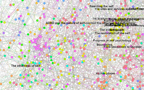
I tried that, without using much of Mahout’s sophistication. I used its ‘rowsimilarityjob’ facility and generated similarity measures for each book, then threw out most of the similarities except the top 5, later the top 3, from each book. From this point, I moved things over into the Gephi toolkit (“photoshop for graphs”), as I wanted to see how things looked.

Screen%20shot%202011-10-11%20at%2010.37.06%20AM

First results shown here. Nodes are books, links are strong similarity measures. Node labels are titles, or sometimes title + subtitle. Some (the black-background ones) use Gephi’s “modularity detection” analysis of the link graph. Others (white background) I imported the 1000 clusters from the earlier Mahout experiments. I tried various of the metrics in Gephi and mapped these to node size. This might fairly be called ‘playing around’ at this stage, but there is at least a pipeline from raw data (eventually Linked Data I hope) through Mahout to Gephi and some visual maps of literature.

1k_overview

What does all this show?

That if we can find a way to open up bibliographic datasets, there are solid opensource tools out there that can give new ways of exploring the items described in the data. That those tools (e.g. Mahout, Gephi) provide many different ways of computing similarity, clustering, and presenting. There is no single ‘right answer’ for how to present literature or TV archive content as a visual map, clustering “like with like”, or arranging neighbourhoods. And there is also no restriction that we must work dataset-by-dataset, either. Why not use what we know from movie/TV recommendations to arrange the similarity space for books? Or vice-versa?

I must emphasise (to return to Ben Fry’s opening remark) that this is a proof-of-concept. It shows some potential, but it is neither a user interface, nor particularly informative. Gephi as a tool for making such visualizations is powerful, but it too is not a viable interface for navigating TV content. However these tools do give us a glimpse of what is hidden in giant and dull-sounding databases, and some hints for how patterns extracted from these collections could help guide us through literature, TV or more.

Next steps? There are many things that could be tried; more than I could attempt. I’d like to get some variant of these 2D maps onto ipad/android tablets, loaded with TV content. I’d like to continue exploring the bridges between content (eg. TED) and library materials, on tablets and PCs. I’d like to look at Mahout’s “collocated terms” extraction tools in more details. These allow us to pull out recurring phrases (e.g. “Zero Sum”, “climate change”, “golden rule”, “high school”, “black holes” were found in TED transcripts). I’ve also tried extracting bi-gram phrases from book titles using the same utility. Such tools offer some prospect of bulk-creating links not just between single items in collections, but between neighbourhood regions in maps such as those shown here. The cross-links will never be perfect, but then what’s a little serendipity between friends?

As full text access to book data looms, and TV archives are finding their way online, we’ll need to find ways of combining user interface, bibliographic and data science skills if we’re really going to make the most of the treasures that are being shared in the Web. Since I’ve only fragments of each, I’m always drawn back to think of this in terms of collaborative work.

A few years ago, Netflix had the vision and cash to pretty much buy the attention of the entire machine learning community for a measly million dollars. Researchers love to have substantive datasets to work with, and the (now retracted) Netflix dataset is still widely sought after. Without a budget to match Netflix’, could we still somehow offer prizes to help get such attention directed towards analysis and exploitation of linked TV and library data? We could offer free access to the world’s literature via a global network of libraries? Except everyone gets that for free already. Maybe we don’t need prizes.

Nearby in the Web: NoTube N-Screen

Syndicated 2011-10-11 11:37:43 from danbri's foaf stories

K-means test in Octave

Matlab comes with K-means clustering ‘out of the box’. The GNU Octave work-a-like system doesn’t, and there seem to be quite a few implementations floating around. I picked the first from Google, pretty carelessly, saving as myKmeans.m. These are notes from trying to reproduce this Matlab demo with Octave. Not rocket science but worth writing down so I can find it again.

M=4
W=2
H=4
S=500
a = M * [randn(S,1)+W, randn(S,1)+H];
b = M * [randn(S,1)+W, randn(S,1)-H];
c = M * [randn(S,1)-W, randn(S,1)+H];
d = M * [randn(S,1)-W, randn(S,1)-H];
e = M * [randn(S,1), randn(S,1)];
all_data = [a;b;c;d;e];
plot(a(:,1), a(:,2),'.');
hold on;
plot(b(:,1), b(:,2),'r.');
plot(c(:,1), c(:,2),'g.');
plot(d(:,1), d(:,2),'k.');
plot(e(:,1), e(:,2),'c.');
% using http://www.christianherta.de/kmeans.html as myKmeans.m
[centroid,pointsInCluster,assignment] = myKmeans(all_data,5)
scatter(centroid(:,1),centroid(:,2),'x');

Syndicated 2011-06-19 14:14:04 from danbri's foaf stories

Querying Linked GeoData with R SPARQL client

Assuming you already have the R statistics toolkit installed, this should be easy.
Install Willem van Hage‘s R SPARQL client. I followed the instructions and it worked, although I had to also install the XML library, which was compiled and installed when I typed install.packages(“XML“, repos = “http://www.omegahat.org/R“) ‘ within the R interpreter.
Yesterday I set up a simple SPARQL endpoint using Benjamin Nowack’s ARC2 and RDF data from the Ravensburg dataset. The data includes category information about many points of interest in a German town. We can type the following 5 lines into R and show R consuming SPARQL results from the Web:
  • library(SPARQL)
  • endpoint = “http://foaf.tv/hypoid/sparql.php
  • q = “PREFIX vcard: <http://www.w3.org/2006/vcard/ns#>\nPREFIX foaf:\n<http://xmlns.com/foaf/0.1/>\nPREFIX rv:\n<http://www.wifo-ravensburg.de/rdf/semanticweb.rdf#>\nPREFIX gr:\n<http://purl.org/goodrelations/v1#>\n \nSELECT ?poi ?l ?lon ?lat ?k\nWHERE {\nGRAPH <http://www.heppresearch.com/dev/dump.rdf> {\n?poi\nvcard:geo ?l .\n  ?l vcard:longitude ?lon .\n  ?l vcard:latitude ?lat\n.\n ?poi foaf:homepage ?hp .\n?poi rv:kategorie ?k .\n\n}\n}\n”
  • res<-SPARQL(endpoint,q)
  • pie(table(res$k))

This is the simplest thing that works to show the data flow. When combined with richer server-side support (eg. OWL tools, or spatial reasoning) and the capabilities of R plus its other extensions, there is a lot of potential here. A pie chart doesn’t capture all that, but it does show how to get started…

Note also that you can send any SPARQL query you like, so long as the server understands it and responds using W3C’s standard XML response. The R library doesn’t try to interpret the query, so you’re free to make use of any special features or experimental extensions understood by the server.

193 older entries...

New Advogato Features

New HTML Parser: The long-awaited libxml2 based HTML parser code is live. It needs further work but already handles most markup better than the original parser.

Keep up with the latest Advogato features by reading the Advogato status blog.

If you're a C programmer with some spare time, take a look at the mod_virgule project page and help us with one of the tasks on the ToDo list!